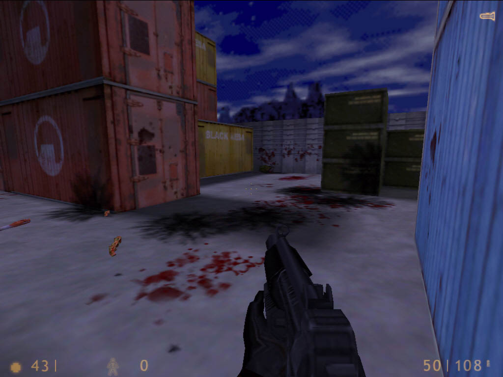
Quake III Arena

Published on 3DGaming.net on 5 February 2000, mere months before I’d leave the world of gaming and enter the world of academia for a decade.
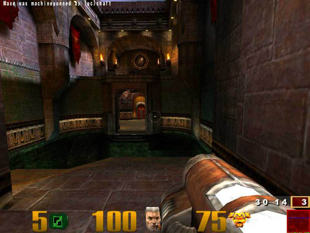

This is your head. This is your head impaled upon a stick.

Concept

Ahh yes, the ever-venerated Quake series introduced the gaming world to 3D. And what yummy 3D it is. Too bad Valve owns yo—! (Editor’s note: The biased writer was executed. We have hired a new writer to take his place.)

It halted the progress of 3d gaming. Suddenly we all want to be a 3D shooter don’t we? After a superior sequel called, ironically, Quake II, id software returns for one more round of ‘The 3D Wars,’ now at your local newsstand.

Nearly two years ago id software announced it would forgo any single player experience at all (good joke guys!) for a completely multiplayer experience. After all the hype and all the speculation, Quake 3 Arena finally arrived on shelves. Original speculation was an all new type of multiplayer experience, where the design would be completely geared for an online experience. Online gaming had been done before with Tribes, otherwise known as perfection, but it was nothing of Quake 3’s standard, or fast and furious deathmatching.

John Carmack even admitted, it was a risky proposition, crafting an online only game. Of course, there are bots to practice against, but that’s secondary to a balanced online experience. Deathmatch has been done many times before, so id had to truly offer something new and intruiguing to make Quake 3 a fun product. That’s the least we ask for, the Bruce Willis equivalent of a videogame. Fast, loud and bloody. Sounds like my Friday nights.

I’m sure you’re wondering how to play Quake 3, and if you’re not then there’s something wrong with you. This is concepts and story! We’re going to tell you how to play Quake 3 whether you like it or not! Those who disobey get to sit in the corner with Romero and the Green Bay Packers.

What you want to do is this: Install the game, double click on Quake3.exe, adjust your settings and get online, then kill whatever moves that isn’t you. Or if you’re playing Team Deathmatch or CTF, kill anyone who doesn’t have the same skin color as you. Otherwise, frag away. Welcome to Quake 3 Arena. Deathmatch refined to its finest. I don’t know how deathmatch could possibly be refined anymore, but hey, apparently it needed to be.

The story can be summed up in only a few words: Ppfftt! Yah right!
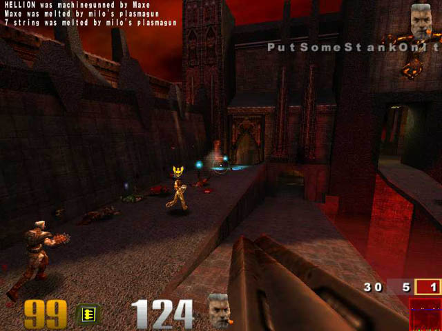
I saw a man and he danced with his wife! In Chicago! (That means gameplay is next)

Does a multiplayer game really need a story? Think about it. When you are running around a map, firing rockets and spewing bullets at anything that moves, do you ever stop to think about the utterly captivating history or storyline of exactly what’s going on? Of course not. And id has never been the king of telling a captivating story either. But yet, id was determined to create the best storyline possible for the type of game Quake III Arena is.

There was some throwaway plot about alien abductions and Dean Martin’s pants. All this and more on next week’s Star Trek Voyager, The Teen Years. Actually, for the literate bunch of you, (Huh? A sentence? You mean those things with words?) if you ever bother to look at the Quake 3 manual, (which if you did, I’d laugh at you) you’d discover that there’s some vague plot about a gladiator, an arena eternal, a ‘We ripped off Mortal Kombat because our writing skills can’t even match that of a five year old,’ plot, lots of blood and gore, and in the end of it all, some Philosopher-cum-rocketlauncher toting mass murderer named Xaero. And don’t forget, this is all a sport. Much like herding sheep. Except sheep can’t fire rail guns, and if they could, well, they’d have to be some pretty durn special sheep.

The manual also has a short description of each character in the game. It would have been nice to see a little more, but then, this is a multiplayer game, so my expectations aren’t exactly very high. Actually they’re about as high as the dirt on the ground. After all, this is id we’re talking about.
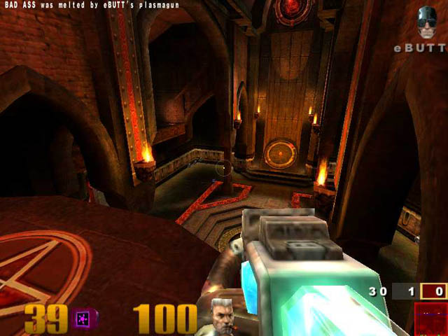
Today’s horoscope: check back tomorrow.

Gameplay

Three words: Fast and Furious. Quake 3 is like the best National Lampoon flicks. Of course, Christmas Vacation is the best of them all, and Quake 3 came out right before Christmas. Ofcourse, it’s all cooincidental. It has to be. Now if only there was a Griswald family skin set, then Quake 3 would tower amongst its competitors. The gameplay seems to be a mesh of Quake 1 and 2 for the most part. Prior to Q3’s inception, the Quake scene was divided into two halves: those who played Quake 1, and those who played Quake 2. Now there comes a third group: those that play Quake 3.

Quake 3 shipped with several modes of gameplay: Free for All, Tournament, Team Deathmatch and Capture the Flag.

Free for All: otherwise known as deathmatch, needs no introduction. Id is the father of deathmatch as far as I’m concerned and will always hold the reigns of the wheel.

Tournament: 1 on 1.

Team Deathmatch: I actually found this to be surprisingly fun. I’d never played team dm prior to Quake 3 and it’s actually pretty damn daft!

Capture the Flag: As if this needs an explanation? Steal the other teams’ flag dumbass!

On a personal note, in regards to Tournament mode, being 1 on 1, I don’t recommend loading up large maps for an obvious reason: the match will last a lifetime.

Now that we know what the modes of play are, let’s talk about the maps and then the weapons.

Deathmatch Maps

Q3DM0 – Introduction: A fairly small map, good for about 3-5 people playing FFA or Tournament.

Q3DM1 – Arena Gate: Good for ffa’s, this map is good for a group of about 5-6 people. Make sure to stop by the big tongue at the back of the map for a truly disturbing experience.

Q3DM2 – House of Pain: Wow. This map simply rocks. 10 + people in this map is all out chaos. An awesome dm map. Cheers to the id gang for this map.

Q3DM3 – Arena of Death: Decent map. Good for about 6 players in ffa mode.

Q3DM4 – The Place of Many Deaths: What an awesome map. One of my favorites in Q3, this map is a blast with about ten people in it on ffa mode. Props to id.

Q3DM5 – The Forgotten Place: What can be said about this map other than ‘chaotic’? One half Giger-ish space trash, one half heavy metal. Add 5-6 people, ffa and stir.

Q3DM6 – The Camping Grounds: Awwww, I cannot say enough about this map. You don’t forget great designs such as this. The Camping Grounds is an awesome display of superior map design. There’s nothing like playing this map with 10 people and Paradise City by GnR blaring from the speakers. Q3DM6 is a classic ladies and gentlemen.

Q3DM7 – Temple of Retribution: One of the infamous test maps. A good map with one weak flaw – the rocket launcher is a blatant camping spot. If you hate campers (like my editor, that filthy bastard Rick) then I’d skip this map. Good for about 7-8 people in FFA.

Q3DM8 – Brimstone Abbey: I knew a girl named Abbey once. Nice girl. Bad temper though. Brimstone, incidentally is also one of the (at the time of this publication) four ctf maps, with more to be released soon by Disruptor (Christian Antkow). 5 on 5 – 6 on6 in CTF or Team DM can get pretty intense. There are some odd dead end rooms that are fun for an easy kill. On an unrelated note, if you get a chance to stop and observe the arches in the main room with the plasma gun, stop and do so. If I didn’t know any better, I’d say that someone has been studying medieval architecture over at id. Fun stuff. The nice use of reds and blues throughout the level is also a nice change from the ever persistent brown and gray palette.

Q3DM9 – Hero’s Keep: Acceleration pad madness. I’ve had more than one fall to my death due to smacking right into someone else mid air on my way to gank myself a rocket launcher. I’d keep the number of players low due to the large number of ‘deaths by pitfall’ that can occur. 5-6 players in FFA. Also a fairly decent Tournament map.

Q3DM10 – The Nameless Place: You got that right. This map has a cool scifi design reminiscent in some spots to aliens with tight and electronically lit corridors. Check out the blue… thing up on the stairs near the mid hallway. It looks like someone broke the teleporter thing from Trek and got it stuck on permanent. A good ffa and tournament map, nice and tight. Good for about 4-5 people in ffa.

Q3DM11 – Deva Station: What a cool map! Just getting the quad is a challenge! Retro is the only way to describe this whacked out map. In some spots it truly feels like an arena, with arena lights up above and everything, and in other rooms it has a space station-ish feel. Like I said, retro but still damn cool. There’s no one theme, but in this case, it doesn’t matter. For FFA this map simply rocks the house. 10 people in this map is a mad rush.

Q3DM12 – The Dredwerkz: If I could rename this level, I’d rename it to ‘BFG: Frantic!’ because of the awesome amount of chaos that ensues when someone gets their hands on the armor, quad, bfg and an assload of ammo. Dredwerkz is a madcap rush of enormous heights, pitfalls, jump pads, acceleration pads, teleport pads and devastating weapons. Load this sweet bitch up with 10 people on FFA and set the timer for 20 minutes. You’ll thank me.

Q3DM13 – Lost World: Remember that killer mpg that was released around the time that the whole ihv incident went down? Remember the cool living orange pillar in the video? Well, it’s here folks! It may not be the main attraction of the level, but it’s still a cool side show attraction. A cool map nonetheless, DM13 is a feast of gibs with 7-8 people getting the smack down on each other in ffa.

Q3DM14 – Grim Dungeons: Sadly, this map isn’t very memorable. There’s nothing that really makes this map stand out other than the surprise near the lightning gun (let’s just say it might offend some people) that I found to be cute. It’s not a bad map, but when compared to the likes of Q3DM2, it loses any sway it might have held over me. Good for about 7-8 people in ffa mode.

Q3DM15 – Demon Keep: Truly a bizarre map, Demon Keep is an immense amount of fun with 10 people blasting away in ffa. Thrown into the map is lava, acceleration pads, jump pads and the rail, making for a wildly fun map.

Q3DM16 – The Bouncy Map: One part ‘The Longest Yard’, one part maze. All parts fun. A decent ffa map, If more time was given to expand this level, it could have been a fierce ctf map. As it stands, it’s a decently fun ffa map that’s enjoyable with 7-8 people.

Q3DM17 – The Longest Yard: One more infamous test map. And also one of the best. This map stands as one of the most frantic with 10 or more people in it. There was some picture on planet quake of a triangle of bodies piled atop one another some time ago that captured my point beautifully. This map shall not be forgotten. FFA with 10 + people is the way to go.

Q3DM18 – Space Chamber: Tall arches and sudden drops into a bottomless black abyss. What more could you ask for? Props to mic for kicking my ass on this map a few days ago. The addition of jump and acceleration pads makes for an experience not to be missed. To the designers of this map: the addition of Matrix-esque gravity could only enhance this already amazing map.

Q3DM19 – Apocalypse Void: Let me get this out of the way right now: I hate this map. It is the most sadistic map I have ever played. I have this theory that I’ve developed that the map designers of Apocalypse Void wanted to induce a feeling of motion sickness combined with anger and frustration so they created this map.

Of course, this probably isn’t a very popular theory. I actually consider this to be a great team dm map simply because I can imagine people taking a large amount of pleasure in knocking their teammates off the sides of floating pads and sending them to their deaths on a very hard surface. With 8-9 people in FFA or team dm is an enjoyable time. Also good for a tournament match.

Tourney Maps

Q3Tourney1 – Powerstation 0218: Blah. A somewhat bland circular map. Nothing outstanding about the design here outside of the consistent use of a purple palette. For 1 on 1’s this is an ideal map, but only for 1 on 1.

Q3Tourney2 – The Proving Grounds: Ahh, one of the infamous test maps. This map sports a spectacular design. The map in one half divides itself into two floors and in another into a tall roofed corridor near a teleporter. Sprinkle with a dash of lighting gun and fog of death and let simmer. A well rounded map that is immensly enjoyable with 10-15 people. Team FFA all the way on this map.

Q3Tourney3 – Hell’s Gate: A moderate sized map, this one feels more at home in a pure dm match than anything else, although it’s small enough that a 1 on 1 match wouldn’t be out of the question, but for ffa I’d stick to 4-5 people at most.

Q3Tourney4 – Vertical Vengeance: The style of this map seems very similar to Q3DM11, which may or may not be incidental. Nonetheless the map design is still solid and stands out. This is a very cool map to get about 8-9 people into for FFA or team dm.

Q3Tourney5 – Fatal Instinct: A remnant of the ihv as someone on the Quakeworld forum (I think) mentioned was originally named Tim1 for those of you that had it. I can’t say I think too highly of this map due to the frustration that ensues due to the piss colored peasoup fog. I can’t say I’d recommend more than 8-9 people for this map due to the frustration that I’m probably not alone in sharing with this map. With a little work, this map could have been improved upon greatly.

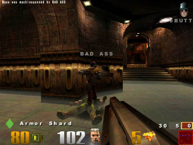
Q3Tourney6 – The Very End of You: What an awesome 1 on 1 map! Awwww, this just needs to be seen to be understood how awesome it is! This is a first: Floating mazes. It’s like a combination of ‘The Longest Yard’ and ‘ The Bouncy Map.’ This map is also one of the few I can find that makes use of the oft mentioned reflective surfaces that Quake 3 was supposed to make use of.
Tomorrow’s horoscope: we don’t care.

CTF Maps

Q3CTF1 – Dueling Keeps: Very simple layout, blue and red teams, nothing out of the ordinary. It reminds me of a few ctf maps from Quake 2 for some niggling reason. The map itself doesn’t really stand out in any amazing way other than it just works. One of the cool little options in this map is to jump through the windows besides the doors in the large corridor between blue and reds’ sides, which is especially useful if your teams happens to be rushing or blitzkreiging.

It’s not an enormous detail, but then, it’s the small details that can really make or break a game. I personally like this map a lot and prefer it over all the other ctf maps. A good sized game would be 5 on 5 or 6 on 6. Anything larger and it would become frustratingly difficult to capture the flag.

Q3CTF2 – Troubled Waters: I’m really not too fond of this level. The corridors wind around a bit too much for my tastes, plus, incidentally, the main throne rooms where the flags are held are somewhat similar to the main rooms in Brimstone Abbey, which is somewhat unusual. A fair sized map, I’d recommend about 5-6 players per team. The water is pretty daft too. Check out the skeleton chillin’ in the water. Pretty cool stuff.

Q3CTF3 – The Stronghold: Meh. Another map I didn’t really take to too much. Y’know, I can understand id’s wanting to ship four quality ctf maps instead of eight decent ctf maps, but only ctf1 really captures my attention. The stronghold is a map that could be a great deal better if it was stripped down to its barebones. As it stands there’s one main hall way where big fights should take place but never really do. It might be because there’s too much open space in the map, but I could be wrong.

I do gotta give props to the sound guys over at id for paying attention to little things like the sound that comes from walking on metallic walkways as it actually adds to the dark atmosphere of the map. This may not be an outstanding map, but it’s not a terribly bad one. Teams of 6-7 are about adequate for this map.

Q3CTF4 – Space CTF: This map earns the honor of being named the most fu%*ed up CTF map I have ever seen. The combo of The Longest Yard and CTF, not to mention portals is pretty damn funky. It’s not your typical map, but it gets the job done. The only real problem presented with this map is lag. One wrong move and you’re bacon. The presence of the railgun only heightens tension. A fair sized amount of players is approximately 6 players to each team for this map.

Remember, there’s no grappling hook. Yes, I too cringed at this. The grapple is such a staple of all the things that defines the Quake series.

Now that we’ve talked maps, let’s talk guns, because we love guns. Guns are our friends. They make us laugh, they make us cry, they make us blow the living sh*t out of one another.

Most of the weapons in Quake 3 are weapons seen in the previous two Quakes, but let’s run down the list together anyway.

The Gauntlet: Whirling saw blade + electrical charge = a “humiliation” (award) on anyone stupid enough to get sucker punched by this badass mofo. Everyone starts off with this weapon that also requires no ammo. Each hit from the gauntlet does 21 points of damage.

Machine Gun: Although not the most powerful weapon, it has a high rate of fire. Each direct shot does 7 points of damage.

Shotgun: The shotgun is a useful spread weapon with a short reload rate. Up close the shotgun is a lethal mofo. It does less damage the further away you get. Testing the damage spread on apocalypse void, 3DGN’s artist Dave Myers and I experimented with the damage of the shotgun on the main platform of the map. At point blank range, with 100 hp and 0 armor, a point blank shot will kill you. At a medium distance (about 10-20 feet away) it does 58 damage and at a large distance away (about 30 feet away) it does 10 dmg per shot.

Plasma Gun: Aahhh, one of my favorite weapons. Having 100 shots, armor, megahealth and quad and going on a rampage with the plasma gun is what it’s all about. Releasing a torrent of plasma pulses upon opponents, the plasma gun is one of the three ‘room cleaning’ weapons. Each plasma pulse at any distance does a total of 6 damage.

Grenade Launcher: Once again, personal preference prevails. I liked the Quake 2 grenade launcher a great deal more. It had a better feel to it. The grenade launcher in Quake 3 has a wide blast radius and each grenade that doesn’t hit point blank and ends up bouncing around has a timed fuse, which can be useful if you’re trying to get out of a packed room and want atleast one easy kill. A direct hit from a grenade at 100 hp and no armor will kill you. End of story.

A direct hit with 100 hp and 50 armor will take you down to 50 hp and no armor. Someone from id mentioned a while back that the grenade launcher had a blast radius. What the exact mathematical calculation is, I don’t know. After having tested it out though, I’ve come up with these numbers: standing right next to a lobbed grenade when it explodes will take off 52 hp. Moving away about 2-3 feet will take off 37 hp.

Rocket Launcher: The rockets fired from the rocket launcher can not only do direct damage, but also splash damage due to their blast radius. A direct hit from a rocket with only 100 hp and no armor will kill you, so I recommend wearing armor at all times.

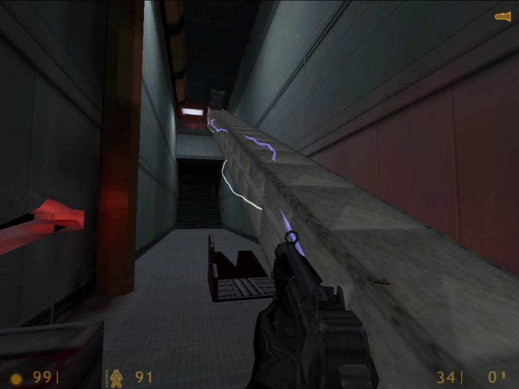
Lightning Gun: Making a return appearance from Quake, it’s the lightning gun! Of course, with time, it’s now changed. Now the gun discharges in water, as opposed to the original Quake, where, if you fired it off in water it was because you had a death wish and a desire for death. Water + Electricity = death. It’s that simple. The laws of physics must be maintained if there is to be order in the universe! Despite this niggling bug, the lightning gun remains one of the coolest guns in the game. Each shaft from the lightning gun does 16 points of damage.

Railgun: Making a return from Quake 2 is the mighty railgun, god to the masses. The speed seems to have been increased ever so slightly, although I could be wrong on this. Quake 2 had a really cool swirl effect that’s been eliminated in favor of a twig like laser beam. Bleh. Where’s the radical effect? Where’s my swirl god dammit? The damage on the rail is a straight unconditional 100 hp. Unless of course you’re wearing armor. 100 hp and 50 armor after a direct hit by the rail will be taken down a notch to 50 hp and no armor.

BFG-10k: You know, I really miss the old BFG-2k. After that, this new BFG just feels underwhelming. I’m probably not alone in this feeling. The BFG-10k fires off massive balls of plasma at your foes. Hmm, sounds like a certain other weapon in Quake 3. For all its vaunted power, the bfg is nothing more than a rocket launcher with a faster firing rate. A direct hit will do 100 dmg. With 100 hp and 50 armor you’ll be knocked down to 50 hp and 0 armor.

So those are the maps and weapons. How do I feel about them? Well, I certainly miss the old BFG. Not having a second firing option also detracts from the game, since secondary firing modes have become a norm in gaming. And I certainly wish there had been more ctf maps to play with. But then again, the grapple could really hurt the gameplay in Q3CTF4, so I can understand the omission of it from the game. I love Q3CTF1 though. It is a kickass map of the highest order. The dm maps are various enough and range from stunning to mediocre, which is expected. You can’t please everyone.

On a side note, I’d like to make the note that Quake 3 should be officially renamed to Descent Quake3. Why? When you shoot at doors, they open. I’ll leave it at that.

Throughout the levels be on the lookout for various powerups:

Green Health: Each cross adds five points of health.

Yellow Health: Each cross adds twenty-five points of health.

Gold Health: Each cross adds fifty points of health.

Flight: Do I really need to explain this?

Haste: Accelerates your movement and firing rate.

Invisibility: Duh.

Megahealth: Adds 100 points to your health.

Quad Damage: Your weapon damage (as opposed to your breath) is multiplied by four.

Regeneration: Your health is regenerated until it reaches 200 or the time limit runs out.
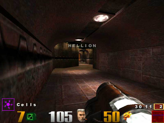
Your friends are laughing behind your back. Kill them.

Graphics

Quake 3 is a pretty game. In fact, Quake 3 is a very pretty game. Between the levels and models, I’m in awe. To the id team, guys, I tip my hat to you. How do you work your magic? Do you tie Carmack down to a chair and force him to work at gunpoint? I always imagined that the id offices would be populated with gordeous women clad in black leather that would motivate staff to work through whatever means necessary, and if that means getting whipped, then by all means, whip away!

You will need a ‘Class A’ accelerator to run Quake 3, as it is a visual feast. I envy GeForce users. What needs to be said that hasn’t already been said? Curved surfaces, heavily detailed models, gordeous smoke trails, and in 3Dfx’s offices, motion blurs. Not that that we care about motion blur, right guys? Right? Guys? Uhhh, guys?

The graphics are certainly outstanding. Shadows fall upon corners with rotting skeletons and heads of programmers, arching tunnels lead to pools of lava, and the water ripples when jumped into. It all looks quite nice. But it’ll also take a hog of a system to run it all. The minumum requirements are as follows:

– A Pentium 233 XXM with an 8 mb video card
– Pentium II 266 with a 4 mb videocard
– K6-2 350 with a 4 mb videocard
– 64 mb of ram

I feel like these system specs should be in a Penny Arcade cartoon where the entire strip consists of Gabe and Tycho laughing at the system specs.

I don’t know how Activision expects to be taken seriuosly by publishing these sorts of things on the side of their boxes. Technically speaking it’s feasible to play the game with such a lack luster system, but you won’t be seeing much of the game. Maybe a few outlines and a flare here and there. Other than that it’s a lost cause.

If you want the specs for a system that will crank out the fps like Sweet Dick Willy on Friday night at TGIF’s, you’ll want alteast a 400 mhz cpu, 128 mb of ram, a TNT1 or 2, GeForce, or Voodoo 3. On my system, which is a 400 mhz system with 128 mb of ram and a voodoo 3 3000, I have an average fps of approximately 30 at 800 X 600 with textures set to 32 bit color, which does actually help, bilinear filtering (enabling trilinear filter just kills the framerate) with textures set at approximately 4/5 their full detail.

There’s a great deal of graphical options that can be enabled using cgi commands not included in the menu options. Remember that you’ll want a powerhouse system to enable things such as shadows. An interesting option presented is the ability to set the detail level to fastest, fast, normal and user defined in the options menu.

The newest incarnation of Quake sports the hyped feature known as curved surfaces. Does it look good? Hell yes. Does it change the game any? No. Once again id uses a palette of mainly brown textures, which begs an important question: is id software colorblind? This is one of the few qualities that upsets me. How many times am I going to play through the same environments again and again? Prior to Quake 3’s release we were all hearing about how we’d be seeing mirrors used prevalently in Quake 3, as well as portals that would allow players to see through to the other side of them.

What did the final product reveal? A combination of Quake and Quake II with improved graphics. Whoopee. Do I get a discount for having purchased Quake I and II? The architecture of Quake 3 is absolutely stunning, but suffers due to sequelitis. Id has been there, done that, so to speak. Dank goth castles with satanic references (which way are those pentagrams pointing anyways? Cause if they’re right side up, they’re not satanic.) have been done to death.

Please, move on. I saw this same design back in ’95. I can hardly tell the difference between the two. Yes, I’m biting with sarcasm. Now you know how my editor felt when he had to review the demo for TombRaider 4. What I’d really like to see is a map of id software’s offices. And John Carmack’s cars if possible. I’ve been looking into investing in a temple of worship for the almighty Carmack.

However, as much of a technological achievement the Q3A engine might be, it took id Software nearly 2 years to reach the power of Epic Games own Unreal engine. And even now, the Q3 engine is still lacking in a few areas. So although the game looks good, it doesn’t actually push any technological limits how Unreal did nearly 2 years ago. But that doesn’t stop this game from bein prettier than a swank chick at a nudie beach. And we all know how fun nudie beaches are.

While I’m on the topic of graphics, let me talk about the models. In the words of the 3DGN homeboys: Eye wub j00 guyz! Paul Steed sir, I worship thee. For truly thou art a god. You and Frank Miller. There’s a certain nostalgia feeling that’s brought up when I see the Doom guy run around killing everyone in sight. I’d like to dedicate a song to you, oh wonderous Doom guy, it’s called ‘Oh Wonderous Doom Guy.’ Original eh? ‘Oh Wonderous Doom Guy, How I love thy lucious rocket launche–. (Editor’s Note: We’d like him to stay on topic as much as you would.)

Cinematics

You’re kidding right? Cinematics? For Quake 3? That’s about as necessary as an enema. Ewww. They’re still cool to watch though, as brief as they may be.

Paul Steed noted in some bulletin board over at Quake World ages ago how he spent some time cooking up a video of his Cable inspired character Sarge. They’re not fmv. There’s a tiny video for every character that you the nameless player must face in a series of tourneys. Outside of that, I quote gamespy on their summarization of the plot for Quake 3: “Ppfffftt.”

They’re well made and look really cool, but they don’t offer much. In or out it wouldn’t change the game in anyway. Nothing much to be said here. I usually just hit escape to skip right past them.
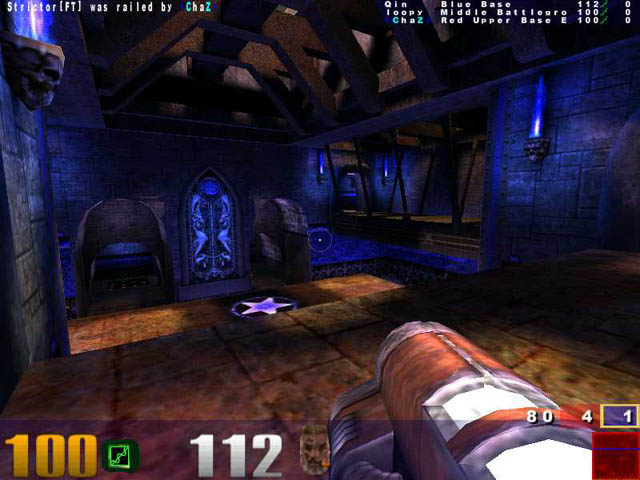
The beatings will continue until morale improves.

Sound

Apparently some time ago someone decided that redbook audio was dead and that all music from now on was to be played in the form of mp3s, as utilized in Wheel of Time and the upcoming (no really!) Daikatana. Unreal used umx format files. Both Quake I and II shipped with the music on the cds. Quake 3 on the other hand does not.

Instead within the pk3 files are several wav files by Front Line Assembly and Sonic Mayhem. It gets better. Now we have to purchase the soundtrack. No longer does it ship with the game. Oh no. We have to pay more. Lovely. At least Romero has the decency to ship his game with the soundtrack in mp3 format.

Welcome back Sonic Mayhem, we have missed thy presence. Lemme tell you something folks, the Quake 2 soundtrack is very freakin’ good, so upon hearing that Sonic Mayhem would be returning to score Quake 3, I immediately became excited. And then I heard the bad news: electronica shall be present. Oh joy. Nevertheless, I remained optimistic that the music would be good, since electronica can range from excellent (anyone remember the music from the opening scene in Blade?) to absolutely horrid (everyone on mp3.com. Get off my planet!)

What I found instead in Quake 3 was a mix of rockish metal and ambient sound. Thankfully I was spared the pompous voice of some “I hate life and wish I was dead,” psychopath who screams into the mic and blows speakers wherever he goes.

As for the regular sound, there’s an option for high and low quality and the option to enable A3D, which upon enabling will absolutely kill your frame rate, so I don’t recommend enabling A3D. EAX is not supported out of the box (read: EAX users got the shaft. Don’t you love independent developers?)

Outside of that, it’s nothing special. Copy and paste sounds from Quake I and II and it’s pretty much done. All returning weapons have if not the same then nearly the same sounds as heard in Quake I and II. Yawn. As for footsteps, they’re there, but it’s nothing spectacular. There’s a footstep sound for regular ground and for metallic ground, but does it really matter in the heat of a firefight? Either way you’re going to die, so you might as well come to accept your fate, and if you don’t like it I’ll spork your ass!


Interface

Hahahahaha.

I feel sorry for whoever designed the interface for Quake III, cause he’s going to get ripped apart by the press. And I think he deserves it. I’ve never seen such an outright sloppy interface. I want a GUI with options. Not a cool logo at the top that allows me a minimum amount of options. It’s as though someone through it together at the last second. The fact that it required a mod maker to fix the multiplayer screen is a sad statement about developers in today’s world.

I want to be able to adjust the size of overlays, of every single last control instead of having to manually edit a config file. Everything should be adjustable. None of this cgi nonsense. If I wanted to learn code I’d go to programming school. Three things must be remembered First of all, Built in server browsers should be neat and organized. Second: Tabs people, tabs! Gamespy uses them for a reason. Take a hint. Third: GUI.

So what did I like about it? The basic options are there. And id did want people to be able to get into the game in three clicks, but did they really have to skimp on design to do so? I think not. And for goodness sake, auto downloading people!
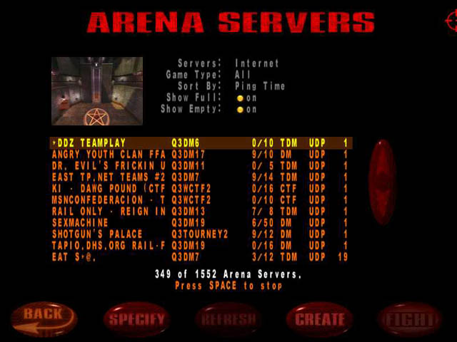
Name filters merely force players to invent creative ways of spelling boner.

Multiplayer

Deathmatch. Team deathmatch. Capture the flag. Tournament. Three out of four require you to turn your brain off. And the fourth, CTF, consists of all of four maps. This is like Clam Chowder. You gotta have the crackers. Without the crackers, the soup just ain’t as good. Manufacturers don’t ship just one or two crackers, but a multitude of them of all different shapes and sizes.

Quake III’s soup shipped with four crackers. It didn’t turn out to be a very good meal. I just made a metaphor to food in a videogame review. That has to be a first. Do I receive any kind of award for being the first?

To understand single player mode, just think: Mortal Combat. And no, I don’t spell it with a k, because that’s improper spelling and my editor won’t stand for that. Don’t you know your grammar?

Let’s talk about the bots first. I’d break down laughing if I wasn’t expected to be taken at least mildly seriously for a part of this review. Prior to the release of Quake 3 the gaming community had been told to expect life-like bots. Well first off, the single player mode should be renamed to ‘Fight The Talking Bot,’ as they are just about the most annoying gaming experience yet seen. Who the hell talks during a match?

I don’t mean snide little remarks such as “You suck Sabre!” but rather, full blown sentences. These guys have mouths that run a mile long. Klesk is one of the more annoying ones. Throughout matches with him he’ll talk about how he wants to eat you. Is this a game or a gourmet buffett? This is what ‘Auto Taunt’ exists for. The bots levels range from ‘suck ass’ to ‘kick your ass’ levels. At nightmare mode it’s absolutely impossible.

Lan-play is also quite smooth, as always. Reports from users on dialup range from “ok” to “horrid.” It really does depend on your isp how well the game will play. Regardless of that, the game is quite smooth over the net, since that’s what it was intended for.

Single player is also included in here, if you really want to call it that. Deathmatch is just what you’d expect it to be: Run around and kill everyone else. No real surprises here except that it plays out like the best of Quake and Quake II.

Team Deathmatch: Uh, yah. Why not just add a flag while you’re at it, since that this is simply Ctf without a flag.

Tournament: This mode is actually quite fun. Matches are one on one only, so wait your turn, although no map is limited to one set mode, so Q3Tourney1 can be played as DM, Team DM and Tournament.

CTF: The weakest mode in the game. The general stance seems to be that Q3CTF1 and 4 are the craptastic maps and Q3CTF2 and 3 are the well designed ones. I enjoy them all myself, but the main problem is just that: there are only four maps. I’ve already heard the argument that ‘We didn’t want to ship 8 or so decent quality maps when we could ship 4 great maps.’ Let the fans decide bub. This is a game aimed at the fans, and in this case, less is not more.

I’ve heard rumor that a certain thematical design was intended for Quake 3. You mean Creepy castles and futuristic landscapes? Yah, we’ve all seen it before. Just give us all the maps you’ve worked on. There are a total of 29 maps in Quake 3. That is not nearly enough for four different modes of gameplay, especially when fans will find themselves sticking with a certain 3 or four maps all the time, as players did with the Q2DM1 – The Edge.

Multiplayer games can be found by simply clicking on the multiplayer tab, which will allow you to sift through local games (meaning LAN or node system for Cable isps such as my own), M-Player (which annoyingly installs itself on your hard drive when you install Quake 3), and regular servers. If you want to join a server while the list is refreshing, simply hit the space bar and click on ‘Fight!’ and you’re on your way.

The one minus to the multiplayer is that there’s no auto download as there was with Quake 2, so if you don’t have a map listed on a server you’re automatically kicked back to the main screen, rather than told that you don’t have the map. It’s a slight annoyance that should be eliminated, much like decaf.

Conclusion

So how do I feel about Quake 3?

Nearly two years ago PC Gamer pimped id and Quake 3 with a world exclusive. The promises excited me, as did the really funky screenshots. The designs were old hat id, but it was still more interesting than what the final product produced, which is a mishmash of gothic castles and science fiction settings. But that’s what id does best, so who’s to complain? Those who were looking for innovation, perhaps.

When it comes to deathmatch, it doesn’t get any better than this. The visceral rush of Quake 3 deathmatch is unparalled. But outside of that and team deathmatch, it’s somewhat lacking as a stand alone product. The Quake series keeps itself alive through it’s fans and the mods they develop. I’ve always found it somewhat tasteless to let a community complete a game a developer could easily have made great. Only now are new ctf makes being released, and mods such as Team Fortress Quake 3, LMCTF for Q3, Rocket Arena 2 and more.

In the nearly two years that id spent working on Quake 3, it could have been very easy for them to comple a variety of different mods into Quake 3 outside of deathmatch. There was some development of this occuring, otherwise the gold edition wouldn’t have shipped with ctf maps. But as Paul Steed said in a post on the Quake World forum, Quake 3 Arena was to be a pure deathmatch title only, and certainly, in that respect it’s done it’s job. But I can’t help thinking that it feels a tad bit incomplete nonetheless.

If you’re a fiend for deathmatch, you won’t find much better than Quake 3. But if you’re a gamer who enjoys a variety of online combat, look elsewhere, because Quake 3 is nothing more than a reiteration and an unneccessary refining of the Quake series. Quake 3 is like the equivalent of TombRaider 3 to me. It’s all been done before.

That’s the problem. There’s nothing new here. All the weapons we’ve seen before in one variation or another, with the exception of the gauntlet. Some of the maps look like direct descendents of Quake and Quake II. There are even models brought back from games past. It’s like the Generations Mod with a new engine. Despite that, Quake 3 is one of the finest 3d shooters on the market and should not be overlooked, despite its flaws. You may pass by one of the most enjoyable games you’ll ever play.

The Goods

Quick Peek: It’s Quake. Again. This time purely multiplayer. Same game as Quake I and II, but with a new engine.
Pros: Stunning deathmatch. A variety of skins. Some of the maps have awesome level design. A new engine.
Cons: Everything else. Shoddy ctf. Repetitive map design that’s been seen in the previous two Quakes, feels rushed, laughable interface. No grapple in ctf. No code to play with upon release. No EAX support. Annoying bots. Lack of innovation.
Value: Been there, done that. Unless deathmatch is the only type of online gaming you do, this just isn’t worth your time.

Grades

Concept: B+
Gameplay: A
Graphics: A-
Cinematics: B+
Sound: B
Interface: D
Multiplayer: A
Overall: A-

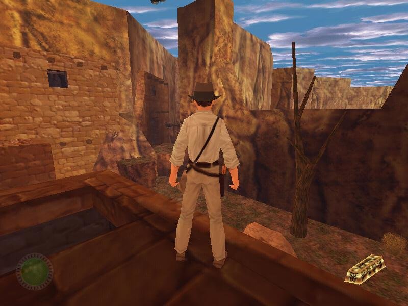
Indiana Jones and the Infernal Machine

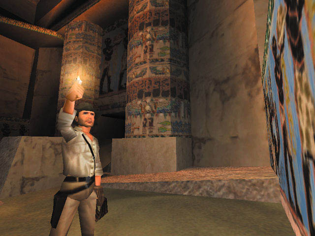
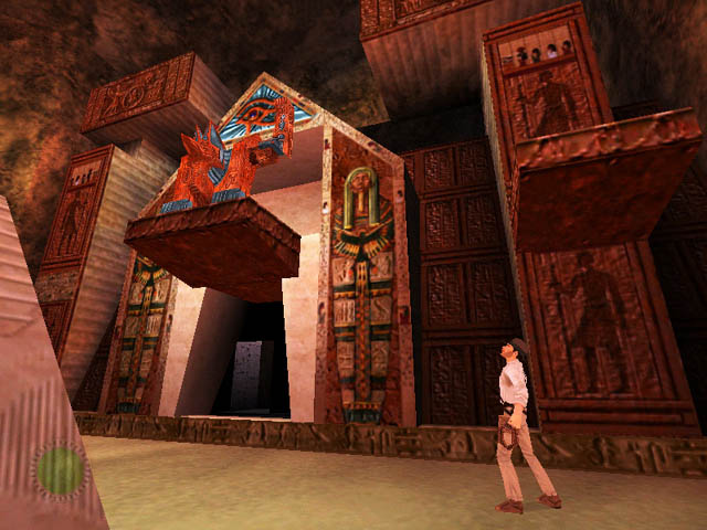
Originally published on 3DGaming.net on 2 December 1999. I did not enjoy this demo one bit. You’ll see why soon enough.


I dreamt I was a Jedi–Oops! Wrong film! Stupid Jedi Mind Tricks!

Infernal \In*fer”nal\, a.
Of or pertaining to, resembling, or inhabiting, hell; suitable for hell, or to the character of the inhabitants of hell; hellish; diabolical; as, infernal spirits, or conduct.

Ten Things I’d Do Rather Than Play Indiana Jones and the Infernal Machine:

1. Play Tomb Raider
2. Sit through an episode of Barney… or two
3. Play Tomb Raider Gold
4. Believe Bill Clinton.
5. Play Tomb Raider II
6. Sit through college lectures on economics and home financing
7. Play Tomb Raider II Gold
8. Hump sheep
9. Play Tomb Raider III
10. And yes, even play Tomb Raider IV.

‘Infernal’ is the perfect description of this melting pot of all things awful about games. It seems as if since releasing ‘Mysteries of the Sith’ LucasArts has fallen into a dirty mucus filled pit where only games like ‘Sin’ and ‘Xtreme Paintball’ are developed. You’d think it couldn’t get any worse than the abyss of mediocrity that the Tomb Raider series has fallen into, right?

Wrong. Thrice within twenty-four hours I attempted to play this infernal thing LucasArts dares to call a demo, and both times I felt like bashing my head into my monitor until I bled. Because of my contempt for this infernal piece of crap, I’m going to attempt to write this demo review in record time so I can get back to my own life and spare myself the misery of playing this incredibly unfun demo.

The only enjoyable factor of the entire demo is the graphical quality, which deserves mention as being the most heavily tweaked engine I’ve ever seen. Originally this was the Jedi Knight engine, before the coding chimps got their paws on it. Of course, it’s nowhere near as pretty as Unreal, but it still has colored lighting and faces that move when people talk, which is always a nice plus to the stale unmoving faces of games such as Tomb Raider and Heretic II.

Outside of the graphics, the rest of the demo makes me want to puke. It’s very easy to understand. A lack of working mouse control, mixed with bad voice acting, piss poor keyboard mapping and an interface from hell make for a bad game. It’s that simple. Half-Life set a bar folks, let’s follow its example and try to go above that bar. Hmm? Can we do that?

I hate to have to say this folks, but there are no redeeming values about this demo. I wish I could be the publisher who has to attach all those wonderful quotes on the back of boxes when this game comes out. I wonder what it’ll say under 3dgaming.net, “It still has colored lighting!” Add a big shiny yellow star and you’ve got a winner folks. Right. If only life were that simple.

I hate to tell you, but this isn’t a Coca-Cola commercial, I’m a bitter 18 year old who has to finish high school, go to college and in the meantime rate a demo that really sucks! It’s like having boobies but not being able to play with them, y’know? How do you screw up Indiana Jones? Jeez, all you had to do was cut and paste Lara with Indy and spruce up the graphics a bit! Heck, I don’t even know. LucasArts, if you’re out there listening, please try and create a game that is actually fun for people to play. You remember how to do it right, like you used to?

Where to begin with the problems in this POS, where to begin… How about with the millions of collision bugs? The laws of physics have stated that arms and legs cannot pass through walls at their whim. So just what the hell does Indy think he’s doing? Next on the list: Control Configuration. I cannot assign space to anything! I need my space! I cannot jump without space! Wait a sec, that’s illogical nonsense. Then again, this is 3DGN.

The control problem doesn’t end here. Oh no, it just goes downhill from here. Turning left and right and backwards is obnoxiously slow. Oh yes, the mouse look is broken. When I move the mouse left and right I do not expect to move. When I move it up and down I expect my vision to change, but not left and right. Are we clear on this matter? The first person camera also decided that it likes to look out from Indy’s chest. If I was a babe, I wouldn’t have a problem with this, but unfortunately, I’m a guy. If this was Lara Crotch, err Croft, I’d have no problem whatsoever.

It’s pathetic that Tomb Raider has smarter controls that Indiana Jones. A long time ago in a galaxy far, far away LucasArts released fun games. A not so long time ago in a galaxy not quite so far away, LucasArts started making games that sucked.

It shouldn’t have been titled ‘Indiana Jones and the Infernal Machine,’ but rather, ‘Indiana Jones and the Stooges who Got Paid to Program Filth.’ Hell, Indiana Jones and the Holy Feta Cheese would have been a title. In a way, it is a fitting title, as infernal perfectly describes this shoddy attempt at a game. If I ran the world, every time a programmer developed a game that absolutely sucked, he and all his partners would be lined up and executed one at a time in a violent and grizzly fashion. Is Indiana Jones great? Only at being extraordinarily bad.

The Goods

Size: 38.84 MB
Pros: Semi decent graphics. The music is kinda cool, I guess. Um… um… sorry folks. This one’s dead on impact.
Cons: Control system from hell, piss poor interface, awkward camera movement, the whip doesn’t do offensive attacks!
Bottom Line: Stay away if you value your sanity. This demo will drain it from you faster than a trip to your local public high school.

Worth It?

Download Factor: 1/5
Overall Fun: 1/5
Overall: 1/5

Half-Life (Vet and Virgin) Demo Review

Published on 17 February 1999, this review featured the analysis of myself and fellow 3DGNer Paul Mordini. Goofiness, of course, ensued.


Paul Mordini in red, Ilya Popov in white.

Better than yelling “FIRE” in school during SATs…

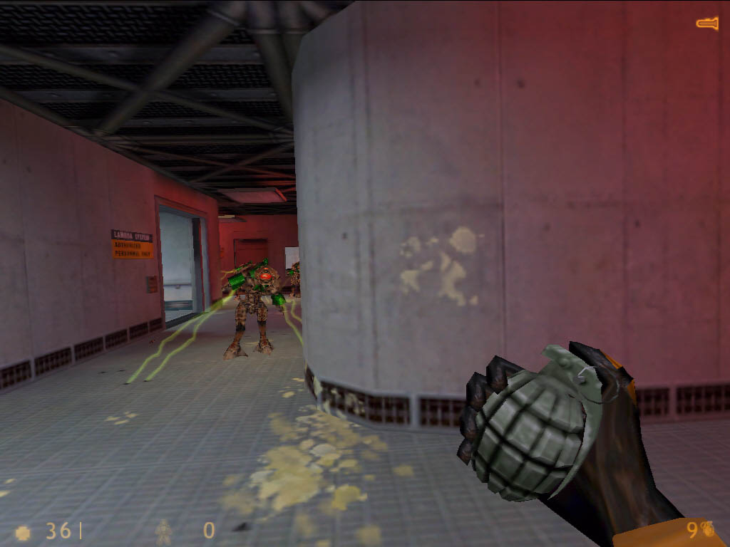
Whenever anybody who has any taste in games says the words “half” and “life”, then we all know that person must be one smilin’ mofo. But alas! Whenever I hear those words in a combination, I just shrug or stare blankly. For I, am a Half-Life Virgin. Yes, I confess *sobsniffle*. But I feel much better having it out now. Having not played this game, I could only imagine from screenshots and crazed online lunatics chanting “Half-Life,” what to expect. All I saw was another 50 MB download. I saw wrong.

I’m wondering what the hell Valve was thinking when they released the demo of Half-Life. As a veteran player of this game, I’ve run through the full game twice just to see what I missed the first time around. Then I got my hands on the demo, and based upon the press release from Gabe Newell, I thought that this could turn out to be pretty damn cool.

Turns out, I’m pretty damn stupid. Frankly folks, if you own the full version, this isn’t worth your time, but if you’ve never played the full game before (I can only wonder what the hell is wrong with you if you haven’t), then this is something that might want to consider. It’s the equivalent of a quickie in your dad’s car, but hey, those’ve always been fun.

The Half-Life: Uplink demo, not present in the full game, is a great deal of fun; it’s kind of funny due to the fact that usually only people with Half-A-Life jump up saying, “Hey, I’m gonna go home and play some more of the such-and-such a game demo”. You sneak along shooting people, creatures, and little canisters with the words “Danger” printed on them, as well as solving slight puzzles and viewing in-game cinematic scenes. The demo takes you to the point of almost crying… it’s so good, then it fades out, leaving you with a burning desire to play more.

For starters, this demo has about as much replay value as a cheap hooker… after the first time you’ll want to find something better. My brain hurts so much that I have to compare this to Sin. The Sin demo was the most amazing demo to come along in recent years, but the full version was a mediocre product, whereas here the full version is astounding, and the demo is merely adequate.

Clocking in at 48.5 MB, I recommend finding a fast server and then playing with socks or something for a few hours. Thankfully though, for those of you that already have the full version, a lite version of the demo can be downloaded that clocks in at 4 mb and requires the full version of Half-Life to play.

Right, I installed, ran the game, looked at the “Game of the Year” AVI clip that seemed a bit absurd to me at the time, tweaked the config, and clicked on new game. Looks cool so far, I go through the sequence, get the crowbar, and die. I smacked the soda machine, and it fell over on me. I do it again, I die. I stuck my face in the steam coming from the back of it. Right-O, won’t do that again. Go along, I die.

The security guard killed me when I smacked him a few times with the crowbar. I learned some things the hard way… you can’t shoot tanks with “danger” printed on them or get by the lasers by blowing them up, unless you want to alert everybody around and take damage. It works to get rid of anything in the vicinity though. Every possible way to die, I did. A soda machine! Felt like the poor sap who tries to take free drinks…

My main bitches are the length of the demo and the level design. The playing time on the demo sucks more than Sweet Dick Willy on a Friday night after kicking back a few pints o’ ale. I ran through the entire demo in under an hour. In the computer gaming world, we call this linear. I’ve played demos that had my rapt attention all day, and this had my attention for about an hour. In a pinch : Wham-Bam-Thank You ma’am. As for the level design, half the time, I felt as if though I was walking through Lego land instead of a warehouse.

The weapons selection was even more horrendous. If you own the full version of Half-Life, then you know what weapons are in the game. Sadly, not all of them are included here. It would have made my day to have the rocket launcher in the demo. That bad ass would show those punks up in the tower what pain feels like… but the fun doesn’t stop here. The worst sin of all? No multiplayer. This is just plain idiotic. It wouldn’t take much to have people set up demo servers. Hell, it worked for Sin, why the hell not do the same for Half-Life?

While all the other options for adjusting controls, graphics, sound, loading and saving games, etc, may be present, the lack of any form of multiplayer is inexcusable.

My friend stops by… he is one of fruity guys, but we love him. I asked him to try this out, (he dislikes Quake due to the way you charge in guns blazing) “Sure, why not?” He gets angry with the sensitivity, plays the game a bit, and decides to try ‘The Hazard Course”. The Hazard Course just runs along through the movements; I was surprised at how fast he picked it up… I mean over here in Quake he usually falls in lava right after spawning and only plays RTS’s. Who knew? Controls are a plus. He plays the game for a while with his new controlling skills then runs out as fast as he can go (he is a large fellow, but he sure can move) to go pick it up.

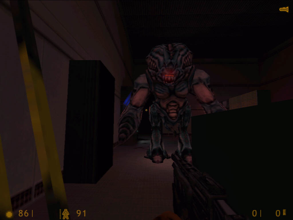
The graphics are still top notch, and the sound is still as good as ever. If you own an MX300 you’re in for a really intense audio experience. For those ‘not in the know’, the Half-Life engine consists of 30% Quake/Quake II code and 70% Valve code. And thankfully there’s a wide palette of colors so don’t run in expecting to see the varied hues of brown and gray that have become id Software’s trademark.

Next to Unreal, this is just about the prettiest shooter I’ve ever seen. Supported out of the box, er, demo, are OpenGL, Direct3D, and software mode. A little something for everyone. And for those of you with the more powerful videocards (read: TNT) you can run the resolution as high as 1024 X 768, if not higher. And thankfully, there are no prevalent bugs, so the game should work fine for everyone.

This demo is the ultimate way to sell a game; it’s crisp, clean, loaded with options, and makes me sad to think I didn’t get Half-Life the day it came out. My friend who loathes first-person games must have seen the light, because I’m still trying to clean up the mess he left on my keyboard. Sticky, yuck.

It’s not hard if you actually use your brain (coughcoughSodaMachinecough) and ingenuity. If you’ve played Half-Life I recommend you try this out just to experience the joy of wanting to play more. Download this now, and keep some paper towels beside you for the safety of all keyboard-kind.

The AI does tend to become a bit flaky at times, and a guard will end up shooting at you to kill a creature behind you, but the full version had the same problem, so pay it no mind. Unfortunately, the demo lacks the atmosphere that made the full version so amazing. And while the demo does contain a new mission (thus the name Uplink), no one said it was going to be any good.

To make matters worse, half the time is spent running back and forth in familiar areas. In short, this is a tiny mission. The Half-Life demo ‘Uplink’ is worth trying for those who’ve never played the full version, but as for myself, I own the full version, and I expected more from Valve. It made me want to eat bad cheese. Shame on you Valve. No hamsters for you.

The Goods

Size: 48.5 MB
Pros: It’s a Half-Life demo, need I say more?
New levels, great graphics and sound.
Cons: It makes me feel as if my mind has been taken over, messages telling me to play… this… game.
No multiplayer, weak plot, too short, no replay value.
Bottom Line: Wow! I have never had a gaming experience like this in my life; I’m still reeling.
While offering new levels for everyone including those who own the full game, there just isn’t enough in this demo to make it worth the download time.

Worth it?

Download Factor: 5/5 2/5
Overall Fun: 5/5 3/5
Overall: 5/5 3/5

Tomb Raider 2 – The Golden Mask

Published on 30 April 1999 at the now-defunct 3DGaming.net. Yes, we actually reviewed demos. Back when that was still a thing.


Eidos is giving us a demo of the ‘gold’ version of Tomb Raider II entitled The Gold Mask. Wow, didn’t Sierra do something similar to this with the last King’s Quest? I smell copyright infringement. I’m going to attempt to explain the logic behind this demo, as it has in its time of existence already broken some of the major laws of physics and has sent the scientific world into a flurry of debates.

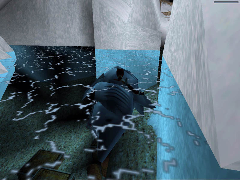
You see Herr Jones, it is not physically possible to walk through walls. Neither can one swim right through a dead shark. Mind you a shark is composed of enormous polygons. And Lara is composed of about 2. One for each breast. How else could this game have sold so well? There is also the question of the shotgun shells lying innocently around snow panthers. I detect pissed off animal rights activists in the distance.

Ah, Lara Crotch, er, Croft, the Demi Moore of the video gaming industry, but more exciting. Well guess what, she’s back. Yippee.

There is a niggling question on my mind. Why the hell release the gold edition now? While there are still Tomb Raider fans out there who’d jump for it like Paul for head cheese, Tomb Raider III crashed and burned, (despite being a good game), and yet Eidos is releasing a gold edition of Tomb Raider II? What’s that smell in the air? Do I smell cheese?

If you’ve played one Tomb Raider you’ve played them all. The demo plays the same as the three other Tomb Raider games, except this demo brings new meaning to the word “stinker.” The ‘Cold War’ mission left me wondering if anyone had ever heard of ‘light sourcing’ as this level just cried out for better lighting. Last I saw, light reflected off of snow.

A hint for those of you determined to complete the mission: use flares often. The problem with flares is that they are dropped the moment that Lara goes into ‘whip it out mode’ and fires off her pistols. Make sure you pick up all the flares in the level, otherwise you’ll have as much chance of surviving as you will of seeing ‘The Phantom Menace’ opening night.

Of course, the enemies also attack at random moments, which made playing stressful as I ended up all too frequently firing blindly in the dark, which quickly became an exercise in futility, despite the auto aim. On that note, including an opening video would be helpful to explain why the mission starts with Lara falling into cold ass water from the middle of nowhere. Or is that one of Lara’s new powers? Big breasts, big guns, and now wings.

The sound is average. Yep. Average. Just the regular ambient wav files copied from Tomb Raider 1. No really. You would think that by now someone would grasp the concept of A3D or EAX or something swanky like that.

Remember way back when Tomb Raider came out? There was an awesome level named St. Francis’s Folly that was simply mind blowing. It was a masterpiece in video gaming history and has yet to be surpassed in sheer originality of design. Now why can’t the same be said of the demo level? For the first time ever in a Tomb Raider game I’m going to slam the level design. I’ve seen better user created levels for Quake. Let’s put it that way. Quake.

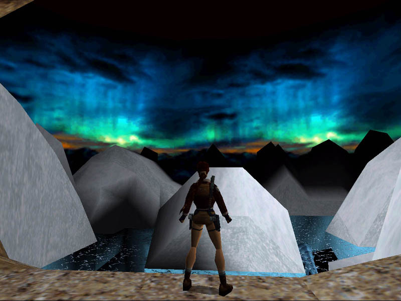
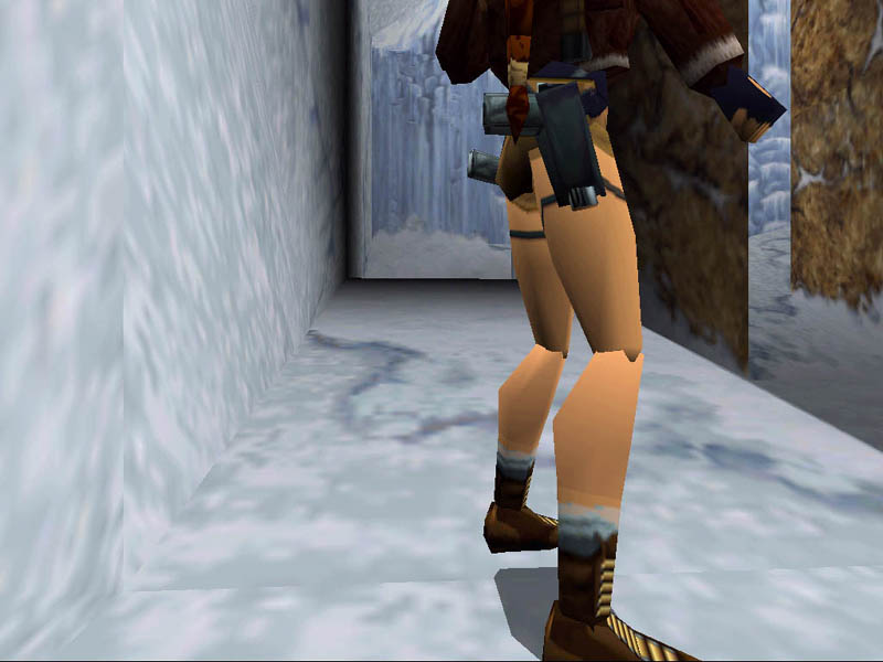
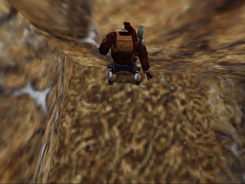
As shown in the picture, the entire level was a bunch of walls and boxes with gourad shading and a bit of color. Of course, there is no map editor either since Eidos doesn’t want mappers making bad maps. Cough. Ok. Then how do you explain this mess of a demo?

Perhaps it’s the repetitive textures and floating gourad icebergs, perhaps it’s that Lara still looks like every guy’s greatest wet dream, perhaps it’s because the series is slowly dying, and Eidos is draining all life left in it. As a demo that’s only 10 MB, there’s a whole lot of nothingness. No really, one mission, no multiplayer, awful keyboard control with no mouse control, no replay value, unless her breasts bring somekind of value that, you know what, I’m not completing that sentence.

This demo has very little going for it. As a Tomb Raider level, it fails to deliver. As an exercise in level design, it makes me want to furiously beat myself into a bloody pulp on the floor. Mark thought it couldn’t get any worse with Gromada. Hey Mark, check this bad girl out!

The Goods

Size: 10.3 MB
Pros: Um, I guess being able to take screenshots of her ass for your friend next door on an old Apple IIe.
Cons: Graphics from the dark ages, awful level design, no mouse control, sounds taken from Tomb Raider 1, her breasts are triangular. This demo really is flat out bad.
Bottom Line: If you like to blow shit up and you have the patience to feel up a real flight stick… this game will smell sweeter than yer mom’s tuna casserole.

Worth it?

Download Factor: 3/5
Overall Fun: 1/5
Overall: 1/5

Rainbow Six: Eagle Watch

Originally published on 11 March 1999 for the now-defunct 3DGaming.net, I clearly abandoned all pretext of taking myself even remotely seriously. But that was also the sort of thing that 3DGN built its image around – we didn’t take ourselves seriously and we tried to offer readers entertaining writing. I like to think we succeeded.


You run around. You shoot stuff that doesn’t look like you or your next door neighbor. And then you do it again. And again.

Concept

In case you haven’t heard of Rainbow 6, it’s just about the most amazing “shooter”, a term I use lightly, to ever hit the market. In a genre flooded with Quake clones, Rainbow 6 was a fresh of breath air when it was released. Unfortunately, the fun was limited by the lack of a level editor. For the most part though, there’s no “real” story. Basically, you get in, you take out the bad guys, rescue some folk, and then go onto the next mission. Not exactly a heart stopping masterpiece, but then hey, I’ve come to expect no brainer gameplay from shooters in this day and age.

The basic premise comes from the Tom Clancy novel of the same name. The concept as written in a book is essentially an anti terrorist squad that replies to terrorist threats before anyone else can, quickly, efficiently, and secretly. And you’re the guy heading the operation. Have fun. As with Tim’s gripe about the storyline, mine is the same. There’s no real cohesiveness here folks, the levels have about as much to do with one another as Burt Reynolds does with good movies.

Ok, so you say it’s cool. What else?

But after a while, that becomes a moot point as the gameplay saves the day. Remember, the game is “loosely” based upon the novel of the same name, but at least the book had a plot. Once again, Rainbow Six: Eagle Watch is a wonderful example of gameplay saving the day. Got that? Good.

With the exception of Mysteries of the Sith, MechWarrior 2: Ghost Bear’s Legacy, and the various addons for X-Wing and TIE Fighter, very few missions packs live up to their predecessors. Rainbow 6 is one of the rare few that does. It’s not a step up from its father, infact, it’s exactly like Rainbow 6, but the level design is so far beyond that of the original that it deserves whatever recognition it gets.

See the bad guy with the gun? Put a bullet in his head.

Gameplay

The gameplay in Eagle Watch is just as amazing as the its prequel. Being a self proclaimed Quake 2 aholic and railgun whore, R6 was one of the few games that changed the way I looked at first person shooters. No longer could I pretend that I was John McLane and that everyone around me was Hans. Now I had to think! What? In a 3D shooter? That’s what made Rainbow 6 so damn amazing. And Eagle Watch is the same way.

The one major issue though is a lack of any real story. The novel has every terrorist event occur to test the main character’s will for some kind of enormous challenge. The game version lacks the same novelty feel that the book conveys, thus losing any interconnectivity between the various missions, other than that they get harder with time.

It’s fun to play. But is it fun to look at?

Thankfully, there’s an option to load a preset map that sets predetermined paths for the other troops to take. It’s sad that the AI on the other soldiers sucks so badly, because had it not, the game might have been more fun. Despite that though, the gameplay rises above the craptastic AI to save the game. I always believed that the point of a mission pack was to continue the story of the original game, and I only wish that Red Storm had attempted to make some kind of story in the game so that the level progression would seem more logical and flowing.

The one fact that must be remembered is: this is a sim. Not an action game. There is a severe difference between the two. With sims, it’s harder to just jump into the game and play. You have to know which keys to use and how to make one thing to do another. Because of this, the keys are always complicated since there are so many of them.

Everything else seems the same unfortunately. The graphics still have the occasional glitches, the AI is still at times fuzzy, and the weapons are for the most part the same. So outside of the levels, you ask, “Well, then what is new in the game Ilya?” Well, from the looks of it, 3 new weapons, 4 new operatives, and some interesting new deathmatch options. Other than that and the new missions, there’s not much else. Sadly, I was hoping for more. But then, they can’t all be golden, can they?

Is the game prettier than an SAT test on a Saturday morning at 7am?

Graphics

In a pinch, it’s the same crap as before. That’s right, in the last half a year or so since Rainbow 6 came out there have been no graphical improvements in the industry. Yup. Right. Ok. Sure. And David Caruso has a career. There’s still the occasional clipping problem, and the flat “I’m a dancing polygon!” look that everything has.

While the models actually do something when they’re not moving, they don’t do much. I think I saw someone scratch his ass once or twice, but that was about the only really neat thing I could think of to mention. Although I don’t want to start up a flame war about this being an aging engine, there’s always room for improvement.

Enough with the shiny monkey’s ass, I wanna see the porn!

Compared to Unreal and Half-Life, I’m left wondering why no one thought to make improvements upon the engine? Were they all so busy working on five levels to stop and think “Well, there’s been some new graphical developments these last few months, and people bitched about a lack of story, let’s give them one!” Yes, I’m very cynical. There was almost a 6 month period where a few people could have made the graphics so much better.

I was hoping for lotsa skin here. I got guns instead. A fair exchange.

Cinematics

In his Rainbow 6 review, Tim mentioned the lack of any real cinematics throughout the game. Same complaint here. Except my opening introduction didn’t have any voice over at all. Just prerecorded gameplay with music. I wish I could have a neat voice telling me about the beat down I’m going to bestow upon the terrorist scum.

The least Red Storm could have done is created some cinematics to make the story actually function. Instead of having me assume I’m going in and introducing people to the wonder of an mp5 because I’m a laugh a minute guy. At least then I’d feel like I had a purpose to play the game. Believe me, every bad guy has an alterior motive. If you don’t believe me, read the Evil Overlord List. I’m sure a bad guy would rather be in his dungeon drinking tea while torturing a victim than going out and setting bombs up all over a building. He does have a life you know.

We call this sound effects. This game borrows it from another game by a similar title, called Rainbow 6.

Sound

Half-Life and Thief emerged before Eagle Watch did, and in that time I expect that everyone all of a sudden said “holy shit!” and began working on implementing better sound it into their games. Rainbow 6 sorta did that. There’s no real 3D sound per say. It really depends on your definition of it. When moving around, my anti terrorist guy made so much noise cause of all the shit strapped to his ass, and who knows where else, that I wanted to personally end his life for not being quieter.

Other than that little flaw, the sound is fairly on the mark. The weapons sound the way they should (although since I don’t know Charles Heston and his little gun toting psychos too well I wouldn’t know, but I would imagine they sound the way they sound in the game).

Perhaps the most outstanding part of this game (other than the orgasmicly lush level design) is the soundtrack. It’s the same as the music on the first CD. But at least it can be said that the music was developed by Hollywood professionals, and whoever wrote the music had something to do with the music from The Rock. It’s good stuff to. I actually listen to it now and then, even though all the songs are short as hell.

It’s good stuff. I’ve heard better, but still, it’s good stuff. As for the rest of the sound, it’s all (and I’m sure you can see this coming… lifted from the original. I guess it’s too much to have some new noises? Maybe have some terrorists shout orders to one another while I sneak around and reveal to them the wonder of my silencer?

Interface

I have to quote another 3DGN writer(Tim) on this paragraph, otherwise it’ll be a waste of html and Office 97. “‘(Woo-ooh-ooh) It’s all been done. (Woo-ooh-ooh) It’s all been done. (Woo-ooh-ooh) It’s all been done. (Woo-ooh-ooh) It’s all been done (done, done) before.’ — This Barenaked Ladies lyric applies here.” I love the amount of originality presented in this mission pack.

3 rings for Elven kings…wait, that doesn’t belong here. Dude, this can take forever to figure out. Have a cookie.

Multiplayer

Anyone else here a Hydra-SB addict? I’ll even accept Gamespy for an answer instead! Now don’t you hate it when neither support a game? Well, that’s yet another flaw. The co-op multiplayer is absolutely rock solid. On a 33.6 the game can get a bit laggy at times if the server absolutely sucks though. And with the one-shot-one-kill attitude, the game can become that much more difficult to enjoy online. And it’s absolutely a must to go and kill a squad member and blame it on someone else. Kinda like that body guard in Out of Sight who shoots himself in the head when he runs up the stairs and slips.

DM in R6 was never very fun, and since there isn’t a great deal of space in which to move, when compared to Delta Force, the DM aspect looses its fun quickly. Fortunately, there are four new options at hand to elongate the online aspect of the game: Scatter, Assassin, Terrorist Hunt, and Save the Base.

There are also six multiplayer modes that derive from the main four types: Assassin, Scatter, Scatter Assassin, Team Terrorist Hunt, Scatter Team Terrorist Hunt, and Save the Base. Each offers something different and helps elongate the life of what could otherwise be viewed as a stillborn child of a game.

You can kill alone, with a friend, in the company of many friends, and with absolute strangers.

Conclusion

This has been something of a challenge to review due to the nature of the game itself. Rainbow 6 was unlike any other game I’d played when it was released. And I’d come to expect quality work from the team that designed the game. But everything presented here suggests a shoddy, rushed product. The manual is a worthless waste of trees. The game ships with all of 5 new missions.

The sounds and music are all lifted from the original game. There are only 3 new weapons. And the install is buggy. I had to reinstall Eagle Watch twice to get it to work. Bugs are amiss to the point where I discovered I had to go and edit something in my registry to play the game. I can only imagine a newbie who doesn’t know what he’s doing editing something in his registry. Oh yes, I had to turn off the opening video as well.

Besides these outlandish bugs and the lack of any story whatsoever, the grand total of 5 new maps and several new multiplayer options just isn’t enough here to make me want to recommend that anyone run out and buy this. And it requires that Rainbow 6 be installed as well. If Rainbow 6 happens to be your favorite game, then I see no reason to not run out and buy this, otherwise it’s not really worth it.

Software developers release new levels all the time online, I don’t see why Red Storm couldn’t have done the same with Eagle Watch. There’s some decent work done here. But everything just seems to not work right together. The multiplayer and interface are the best parts of the game, and although the concept is neat, it’s just not deserving of a higher grade.

The Goods

Quick Peek: A unique and challenging first person shooter than requires as much thought as it does balls.
Pros: Interesting concept and gameplay, varied internet options, stunning level design.
Cons: Pathetic manual, new troops are useless, only 3 new weapons, only 5 new maps, no level editor, AI tends to act idiotic.
Value: If you don’t already own Rainbow 6, you can pick it up and throw in Eagle Watch for another $20. If you like shooters with a twist, give this a whirl.

End of the Line

System Reqs: Pentium 166, 16MB RAM, Rainbow Six
API’s Supported: Direct3D
Hype Level: 5/10
Overall Grade: C
Recommendation: For fans of the original who have the patience for this, it’s a fun experience. But if you’re willing to shell out $60 for Rainbow 6 and Eagle Watch and you know you’ll love it, then hey, go for it. Otherwise, it’s a cheap thrill that can be saved for something more worthwhile. Buy a book.

The Grade

Concept: B
Gameplay: B
Graphics: D
Cinematics: N/A
Sound: D
Interface: B-
Multiplayer: A
Overall: C

The Art of the Newsletter

Originally published on LinkedIn in February 2021.


Something that’s really hard to do right is the newsletter.

No, seriously. Have you ever tried it? Or talked to the people at your company responsible for producing them?

Too often, it’s treated as something that can be put together and flicked out in one afternoon like it’s no big deal – as easy as making a cup of tea, right?

You could not be more wrong.

There’s so much mental legwork involved. Stop and consider, for example:

  1. What sort of tone should it have? Well, that depends on the size of the company, the kinds of people it hires and their personalities, the company style guide, legal policies around language, branding regulations – just to name a few factors.
  2. How long should it be? One page? Two?
  3. What information is absolutely necessary? Do you think readers will care about what Netflix series the staff have been watching?
  4. Should it feature internal links, external links, or both?
  5. Can you include photos? How about staff photos? Have you received permission?
  6. How often should you send one out? What’s the fine line between company updates and spam?

There are so many factors that merit considering when putting a company newsletter together.

What if you have different mailing lists with different content expectations? Now, suddenly you have to consider and factor in segmented marketing logic and implementing a more robust and careful filing system, to ensure the right content goes through the right content management delivery systems.

Speaking personally, I’m more likely to read a newsletter that doesn’t take itself too seriously, doesn’t overwhelm me with content, includes a few jokes or puns, some interesting insights, and even a helpful tool tip or two.

What sort of newsletter works best for you?

Mastering SAP Highlights, Sydney 2019 (Part 3 of 3)

Back in 2019, a friend recommended me for a weekend gig that involved attending and covering an SAP conference in Sydney. Being completely curious and interested in what this would entail, I said “yes”. So here now is the third of three articles produced for Inside SAP.

This piece was published on 28 March 2019.

The original piece can still be read on the company’s website.


Ilya Popov shares his thoughts on attending Sydney’s Mastering SAP 2019 conference.

As with every conference of this scope, there were more presentations and people to meet than it’s humanly possible to do within a specifically allotted amount of time. Luckily, we were able to ultimately meet, shake the hands of, learn from, listen to, and even interview several people.

It’s easy to forget that these yearly gatherings would not be possible without the tremendous background effort of the organisations involved in helping these events come together. The Eventful Group spent nine months preparing alongside organisations, speakers and venues to make it happen, and the entire event went down without a hitch and ran like clockwork. That’s no small feat. On behalf of everyone at Inside SAP: THANK YOU!

The Eventful Group did not operate in isolation – they had the help of their sponsors and partners, including Diamond Partner, EY. Standardising procedures, improving workflows, submissions methods, programming bugs, information at this conference is of benefit to every single Australian SAP user.

But what did Inside SAP think?

Well. Change certainly came up a lot. A considerable amount of time was spent discussing the human factor. How do we get people on board? How do we help others understand change? How do we train up people who’re in the latter half of their careers and need to learn new protocols and procedures? How do we explain the importance of cybersecurity to them?

Casualisation is another matter of concern. Australia’s economy has shown an increased number of employees working casual hours due to a variety of needs. SAP’s staff, particularly at Fieldglass, stressed that the permanent workforce is going nowhere, to the relief of many. But do expect to see more contract positions come into existence, for short- to medium-term projects – particularly for those initiatives that require skills from overseas.

And finally, there was the concern around communication. Particularly around employee layers within organisations. Whenever change occurs, it will be important for any organisation to have those who readily embrace change, those who are hesitant, and those who question its need. Each of these three social divisions can be of benefit to each other, to ensure that fools don’t rush in where angels fear to tread.

It’s important for co-workers to have a mutually beneficial back-and-forth dialogue, and to teach and train one another. Particularly when dramatic new changes occur – in such instances, the importance of having enthusiastic employees willing to convince their co-workers of the merits of change is vital.

In the words of Richard Hunt, Managing Director of Turnkey Consulting:

 “In my experience these events can often be overrun with consultants and vendors but at this one I saw a real commitment from client teams who were there to learn and network. So hats off to the organisers!”

Change, education, communication, all of this leads to well-oiled organisations ready to face the future and ready to engage with changing security protocols and measures, and thus expect the same level of compliance from any and all partners and supply chain partners.

-Ilya

Mastering SAP Highlights, Sydney 2019 (Part 2 of 3)

Back in 2019, a friend recommended me for a weekend gig that involved attending and covering an SAP conference in Sydney. Being completely curious and interested in what this would entail, I said “yes”. So here now is the second of three articles produced for Inside SAP.

This piece was published on 27 March 2019.

The original piece can still be read on the company’s website.


Last week, many delegates attended Mastering SAP in Sydney to ask about Agility and the future of the workforce.

In this space, Toni Jackson (APAC Director, SAP Fieldglass) highlighted 3 key elements affecting the future of work, which she identified as: 

  1. Talent and technology transformation
  2. The new Agile workforce
  3. Regulation and innovation

With 70% of business leaders believing they need a new mix of talent and skills in the future, Toni provided further information for companies and employees coming to understand and integrate agile methodologies into their workplace practices:

  • Traditional employees will be joined by contractors, freelancers, and crowd-sourced talent
  • Routine work will be further automated by robots and AI
  • Companies will focus on truly human skills
  • Careers will be built around learning rather than jobs

A few more key takeaways we highlighted from the show included the importance of bringing people along for the transformation and change journey and including the human factor in change and its cousin, security.

Alongside the changes that are happening in the workspace, technology shifts are a concern from an operational and legislative standpoint, as discussed by Grant Smith (General Manager, Energy Queensland).  When we deal with issues like identity theft or cyber attacks, he explained, we don’t actually know anything about the human that’s engaged in the theft. We only experience the repercussions of their actions. He said:

“It’s one thing to identify the Human. It’s one thing to identify the Machine. It’s another thing to identify the Human behind the machine”

David Roberts (VP, Executive Advisory Council, SAP & Advisor, UnderArmour USA) discussed a paradigm shift in his presentation “The Case for a Finance-Centric Organisation.”

“We were able to have a discussion around SAP HANA for finance and what it means to shift the paradigm from the traditional way to run the business to having a finance centred business and how other companies have gone through that journey.”

During his talk “Making Digital Change Happen,” Andrew Bettenay (CIO, Endeavour Energy,) pointed out very clearly that

“Coming up with a strategy that makes sense can and must be done quickly. But do not assume that all impacted stakeholders are able to come on the journey as quickly.”

This same sentiment was shared by Mark Weatherford (USA Department of Homeland Security’s first Deputy Under Secretary for Cybersecurity.). When asked about what was of paramount concern to him, Mark explained:

“My greatest concern honestly is the third-tier suppliers that you touch too because you really don’t know what they’re doing, what their posture looks like, and what their security practices are, and if they’re touching your environment you basically get their diseases.”

In a heavily Security and Risk oriented conference, many speakers made it clear that their are more questions than answers. What’s needed is more communication and education around security. We need to develop imaginative minds, capable of envisaging potential problems or issues before they arise, so as to catch them in advance. We need to first remember that we’re dealing with technology and the people behind it. 

Read part 3 here.

Want to know more about the speakers and their companies? 

SAP Fieldglass: https://www.fieldglass.com/

Under Armour: https://www.underarmour.com.au/en-au/

Endeavour Energy: http://www.endeavourenergy.com.au/

Energy Queensland: https://www.energyq.com.au/

Mastering SAP Highlights, Sydney 2019 (Part 1 of 3)

Back in 2019, a friend recommended me for a weekend gig that involved attending and covering an SAP conference in Sydney. Being completely curious and interested in what this would entail, I said “yes”. So here now is the first of three articles produced for Inside SAP.

This piece was published on 26 March 2019.

The original piece can still be read on the company’s website.


Mastering SAP Sydney too place last week on the 18th and 19th of March. The opening presentations had a strong emphasis on security and risk in addition to recurring industry staples.

As with most trade shows and conventions, there’s never enough time to meet, speak with, and catch up with everyone we’d like. However, we did have the pleasure of meeting several brilliant people and attending some highly informative presentations. Notably, we listened in on Mark Weatherford (former USA Department of Homeland Security’s first Deputy Under Secretary for Cybersecurity) providing unique insights into the world of supply chains and the risks they can be exposed to through a lack of due diligence and poor security. 

Organisations both large and small can make the exact same mistakes and suffer equally similar financial, social, and physical repercussions. Consider the assorted manufacturing and distribution pipelines at risk for the car manufacturing industry in a world where we can buy German cars with Dutch engines that have Taiwanese computer sensors, American-made wheels, powered by petrol imported from the UAE. The fallout that would ensue if even a single link in that chain were to rupture or break for any period of time can have vast and negative knock-on effects upon other connected suppliers, distributers, wholesalers, and retailers.

As such, it’s important to map one’s supply chains, identify where problems might emerge, and critically: engage with staff. Want to avoid having staff that feel like a nameless cog? Engage with your employees. Brief them regularly. Create a culture that values security and awareness – to know how and when to spot potential issues or problems. 

The changes being undertaken by the ATO are a particularly relevant subject to many delegates at Mastering SAP. Matt Voce (Local Product Manager, SAP Australia) addressed Single Touch Payroll in his session: “Deep Dive: Understanding Single Touch Payroll for a Successful Go-Live.” The ATO is currently undergoing the biggest change in tax-related legislation since World War 2.  We live in a world of constant change, uncertain as to how anything will work in the future. Yet Australian tax law has, despite obvious developments, not undergone a drastic upgrade in over 70 years. 

Matt shared advice and guidance on navigating the change as the STP deadline approaches on the 1st July 2019. His session included a live demo and real feedback from SAP Payroll customers.

As many surely noticed, the topic of security was also a focal theme at the conference. And who better to speak to on the matter than Melissa Price, the CEO of Aust Cyber, who spoke of the importance of a holistic and inclusive strategy to ensure good security practices, standards and enforcement. 

“Everyone is responsible for security now”, because if organisations are going to manage risks, it has to involve people from different business unites, and every single person in an organisation needs to be provided a unique set of incentives to entice them to learn about and care about security and change in policies, software, hardware, and procedures. But to avoid a simple band-aid solution, we need to employ change management to ensure the right long-term decisions are made and applied properly.

On Identity Management, we spoke with Simon Ell at Sailpoint, a company that specialises in identity governance, risk management, and access certification. Consider: staff members come and go at organisations, and sometimes a new hire will inherit the computer and access privileges of the previous owner of that particular position. Often times, inheriting a person’s role involves having access to all the same files, directories, and systems of the previous job holder. 

But is that necessary? Should someone be able to access folders and files they don’t understand or don’t need access to? Failing to track folder privileges can lead to security risks. 

There’s an obvious overlap between the need for wise managerial policies that can ensure employees remain engaged and understand the value of sound and change-prone security policies. Such goals cannot be attained if we do not first stop to pause and reflect upon a long-term strategy. 

Opening speaker Dr Jason Fox, summarised the concept when he said: “I guess my hope for folks is that we can pause and reflect a little bit more.”

Read part 2 here.

Interested in learning more about the people we met?

Dr. Jason Fox: https://www.drjasonfox.com/

SAP Australia: https://www.sap.com/australia/index.html

AustCyber: https://www.austcyber.com/

The Nervous System, or Share This!

Back in 2018, I briefly worked for a travel company. In the time I was there, I got this one article out the door, that looked at platform capitalism and sharing economies.


“Nobody legislates technology into being. They don’t legislate the birth of the internet or cell phones or anything. They’re called forth into the market, and the people who call them forth often have absolutely no idea how these things they’ve thought of will most change society. It’s impossible to tell until people have the things, and they’re using them.”

– William Gibson

Duty of Care: a moral and/or legal obligation to ensure the safety or well-being of others

This modern life

Are you planning to travel in the near future? If so, it’s likely that you’ll be dealing with hotels and taxis. Why? Because over the last sixty years, and two millennia, it’s become the norm; people expect to have to use both when travelling. Especially business travellers. They need to get around. And they want to do it with minimal fuss and hassle. The whole thing should be as easy as ordering a pizza.

Ideally.

But consider what’s under the hood of this process? What goes on in the engine powering the world’s travel systems? It’s not a question commonly asked; we’ve become so accustomed to simply being able to travel from Point A to Point B that there’s no mystique, no curiosity in the background procedures, protocols, and processes that daily ferry humans around the world for business, leisure, and other assorted reasons. Ever wonder how payments are processed? How insurance policies are agreed upon? Who decides what airline and car rental company you’ll be using?

For corporate and business travellers? Here’s what’s under the hood. Their employer will likely utilise the services of a travel management company (TMC); the TMC in turn will provide the organisation with a travel policy. What, dear reader, is a travel policy? Well, here’s how QBT lays it out to The Uninitiated:

‘The purpose of a travel policy is to provide employees with clear guidelines around the expenditure of their employer’s funds for business travel. The policy clearly outlines the process to be taken when booking travel for business reasons.’

Travel policies include recommendations such as what online booking tool to use, which payment methods to utilise, rules for domestic and international travel, preferred approaches to hiring cars and organising other ground transport, and more. By following the guidelines laid out in a travel policy, a traveller remains “in policy”. Which TMCs like. It helps them meet their Duty of Care obligations. A company’s travel policy? It’s their Yellow Brick Road.

Ebb and Flow

Generally, we can rest assured knowing that everything will be fine. There’s an order to things, a rhythm, structure. We know how things will work. There’s a concierge at the front desk, near a vaguely rectangular stand containing hundreds of brochures and guides to local sights, attractions, oddities, restaurants, pubs, as well as maps of the region.

It’s comfortable, knowing what to expect. It helps reduce our stress levels, makes us feel safe, and allows us to get on with dealing with other matters of importance to us, be it social calls, business matters, or personal engagements. We want to be able to get on with things with a minimal amount of fuss and stress.

The reason we’re able to do so is because of the complex and interwoven set of human actions and digital protocols that weave together to ensure we never feel unsure of ourselves, and know what to do even in the most unlikely of circumstances. We’ve been given phone numbers, contact details, our employer knows where we are. All things we don’t really think about it because it’s what we expect.

Welcome to quality duty of care.

Duty of care exists to ensure that travellers, be they clients or employees, feel safe, taken care of, have had their travel process made as easy and simple as possible, are armed with the most up to date information, know what to expect, and who to contact and what to do in the case of an emergency.

And we expect this. It’s the norm.

No maps for these territories

Circa 2018, our picture of what The Norm ought to be has found itself frazzled. Over the last decade, an emergent phenomenon identified as the Sharing Economy, or the Platform Economy in some instances, or even Platform Capitalism, has slowly infiltrated the structures put into place to hurl us around our pale blue dot.

The question seeking to voice itself in your mind probably wants to know: is there a difference between those terms, or are they all just synonym of each other? Let’s burst the bubble right now: they’re not the same thing. They may share a common set of roots, but they are not an equivocal set of terms.

Allow me to explain.

Let’s start with the term ‘Sharing Economy’. When this term is used, it’s usually understood to be referring to legitimate, albeit small organisations and platforms, the kind that exist to engage in a legitimate sharing – be it of services through apps such as Yerdle, a communal centre such as Sydney’s reverse garbage centre in Enmore, or even a community neighbourhood page on Facebook where neighbours can ask for assistance. The idea behind it is as simple as it sounds: help one another out in the spirit of community spirit. Think of them as localised life hacks.

Then there’s the ‘Platform Economy’. That’s what Uber, Lyft, Airbnb – large, heavily-valuated services – are, even though many insist on referring to them as being part of the “share” economy. It’s a little misleading. These organisations – they’re different beasts, and arguably are little more than digitally-enabled expansions of the existing market economy. As some technology critics have argued, the nature of their software, social design, and business approach would in fact mark them out as being the opposite of sharing. Thus, as mentioned earlier, another term used to describe such organisations is Platform Capitalism.

For better or worse, the emergence of this (usually app-driven) secondary economy has presented new and unusual challenges to travel management companies and how they tackle duty of care, as well as customer expectations – something that inherently ties into duty of care.

If we consider, for example, Airbnb, we find a Platform Economy service that, according to the American Bureau of Statistics, led to a 3.7% decrease in annual hotel profits in 2014. How and why? By providing alternative accommodation options that provide travellers with a novelty – or more “authentic” – travel “experiences”, as well as – potentially – a way to meet new people, establish new friendships and even business connections.

From the viewpoint of those with temporarily rentable spare rooms, it provides a means by which to earn a secondary income ― what Airbnb refers to as “microentrepreneurs”. The perception, the narrative, if you will, that they’re trying to present to would-be users, is thus: why stay in a boring template hotel room, when you, the traveller, can have a more authentic travel experience by staying with a local? It’s as though someone took the Pulp song ‘Common People’ and actualised it into a business plan.

Why stay in an expensive hotel, when you could stay in a comfy, homey, “real” home, in a location that is closer to where you need to be and cheaper than a hotel? And perhaps some of those available accommodations might be closer to a desired location. Or might be cheaper than a hotel.

And of course, the emergence of these services has forced hoteliers to reflect upon their service offerings and seek to adapt to changing customer desires and expectations to compete with the rise of alternative hotel offerings.

The millennial dollar question

The million-dollar question then. What happens if hotels don’t start catering to or try and conform to the needs of contemporary travellers? Well, there is a clear and very obvious concern of losing business, for one, and staff as well. So what’s a hotel or taxi company to do? One option? Start buying up share services, as AccorHotels did when it purchased Onefinestay, a London sharing-service geared towards the high-end market.

Alternatively? Listen to the complaints, and ask the question: why are an increased number of people choosing to use alternative platform services in lieu of established services? What makes a person choose an Airbnb over hotels – a place that guarantees 24/7 reception assistance, privacy, good WIFI speeds, and doesn’t ask you to worry about anything beyond waking up on time?

For better or worse? It’s the experience of the thing.

The current generation? Millennials? Like it or not, they’re reacting against nearly two generations of structural developments which they find soulless, stale, and devoid of any personality. As many hoteliers are slowly discovering, contemporary clients don’t just want a place to stay – they want a hotel that provides a genuine and real experience.

What does that mean? What does that look and sound like? Tune in, listener.

Increasingly, patrons want to have authentic local cultural “experiences”, be serviced by staff members in a less formal (read: “real”) manner, use brands that provide more socially-oriented and progressive attitudes, access fully operational apps, or even something as simple as homier settings. Customers value staff members who are encouraged to establish meaningful and sincere connections with them – to provide a human encounter.

But – because of course there’s a “but”: does that attitude apply to business and corporate travellers? After all, that is the big fish in the hotel industry. Airbnb has certainly tried to get their foot in the door of that market by offering up an Airbnb for Work service. How exactly does that work? Well, it’s not as easy as renting out a simple room.

To quality a property for joining what Airbnb calls the “work collection”, properties must provide, in addition to standard requirements (e.g. amenities, responsiveness, etc.): Wifi, self check-in, a laptop-friendly workspace, an iron, hangers, a hair-dryer, and shampoo. In addition, Airbnb will provide the companies of business travellers with a tool to track spending, receive invoices directly, and manage employees’ itineraries.

The big but – the one that’s a giant eyesore of a white elephant in the room is this: will it appeal to corporate and business travellers? While there has been some researched published that suggests homesick road warriors might find it appealing, many organisations remain ambivalent about the prospect of utilising such services, due to not meeting standard duty of care regulations – notably: an inability to vet the lodging space.

So what should hoteliers and their users alike do?

Be here now

It’s in the best interest of more established, traditional organisations to improve the harmony of their pricing options, branding, and guest experiences, to ensure they can compete with these emergent platform economies. For the business and corporate flyers – their employers need to focus on those things they can control: providing better, more up to date duty of care packages.

Sending a traveller somewhere? Ensuring their safety (duty of care) is paramount. It’s not enough to tick a few security boxes; apply a healthy dose of imagination, to determine what other steps can be taken to ensure that the client feels safe and taken care of. Make sure you know how to get in touch with them should emergency strike.

Are they carrying a phone? Supply an extra charger. Travelling in a taxi? Does it have GPS? Have they been supplied with the most up to date and recent information on their destination, to help them better understand what to expect? Does your organisation have staff available in the location to which they are travelling? Has the organisation performed a thorough risk analysis? Is the client aware of who to contact or call in an emergency situation? Dear reader, if you don’t have an answer for any of these questions, help yourself and your organisation by talking to QBT’s travel representatives.

The locus of control

One element of the duty of care package is something called a Travel Risk Mitigation Toolbox. Their function? To help organisations and travel management companies alike better service the needs of their customers. Which is what QBT provides. 24/7 in-house information service? Check. Real-time alerts? You got it. Traveller tracking with emergency warnings and updates? Absolutely.

At day’s end, obviously, there is only so much any travel management companies can do, including reminding and encouraging their staff to not book out of policy, as that makes everyone’s life and jobs fantastically more stressful and unpleasant. The moment a traveller books out of policy, their nominated travel management companies won’t be able to track their movements. It’s a total jack move, booking out of policy.

Have a better time than most can dream

Platform capitalism and sharing economies are here to stay. We all need to take a deep breath and accept that reality. It’s a case of adapt or die. We need to understand what this new emergent economy is, its many different facets, and what companies / corporations / organisations should know and consider when thinking of embracing, if not even working with, this emergent system.